It is dangerous to bind Radio Buttons to an enumeration with ValueConverter!

Binding a set of Radio Buttons to an enumeration is ubiquitous task but it’s not as easy as it might seem at first glance.

The Problem

One proposed way to do this is to bind each RadioButton IsChecked property to the property (defined somewhere in data model) providing current (selected) enumeration value and use ValueConverter with parameter to convert this current value to boolean and vice versa. This approach is recommended in some rather recent blog and forum posts, e.g. WPF: How to bind RadioButtons to an enum?, Databinding enum to radiobuttons, etc. It works when you change current enumeration value by hands in UI, but if you do it in code the button loses its binding! In that case you have the bug which isn’t easy to reveal.

The Example

Mark Smith (Julmar) uncovered the reason of this behavior in his excellent blog post MVVM: Binding RadioButton groups. In this post I want to show what happens by example. I took most of the code relevant to Radio Buttons to the enumeration binding from WPF: How to bind RadioButtons to an enum? forum thread. The window of the example looks like follows:


Fig. 1 Example screen until you change selections by clicking RadionButtons.

There are two panes in this window with subtle differences.

The left pane uses ValueConverter named “EnumBooleanConverter”:

public class EnumBooleanConverter : IValueConverter
{
    public object Convert(object value, Type targetType, object parameter, System.Globalization.CultureInfo culture)
    {
        string parameterString = parameter as string;
        if (parameterString == null)
            return DependencyProperty.UnsetValue;

        if (Enum.IsDefined(value.GetType(), value) == false)
            return DependencyProperty.UnsetValue;

        object parameterValue = Enum.Parse(value.GetType(), parameterString);

        return parameterValue.Equals(value);
    }

    public object ConvertBack(object value, Type targetType, object parameter, System.Globalization.CultureInfo culture)
    {
        string parameterString = parameter as string;
        if (parameterString == null || value.Equals(false))
            return DependencyProperty.UnsetValue;

        return Enum.Parse(targetType, parameterString);
    }
}
and corresponding XAML:
<StackPanel>
    <RadioButton Name="rb11" IsChecked="{Binding Path=CurrentChoice1, 
        Converter={StaticResource enumBooleanConverter}, 
        ConverterParameter=One}">One</RadioButton>
    <RadioButton Name="rb12" IsChecked="{Binding Path=CurrentChoice1, 
        Converter={StaticResource enumBooleanConverter}, 
        ConverterParameter=Two}">Two</RadioButton>

    <Button Click="btnNext1_Click" Margin="2">Next choice</Button>
    <Button Click="btnRandom1_Click" Margin="2">Random choice</Button>
</StackPanel>

The right pane uses ValueConverter named “EnumBooleanConverter2”:

public class EnumBooleanConverter2 : IValueConverter
{
    public object Convert(object value, Type targetType, object parameter, System.Globalization.CultureInfo culture)
    {
        return value.Equals(parameter);
    }

    public object ConvertBack(object value, Type targetType, object parameter, System.Globalization.CultureInfo culture)
    {
        if (value.Equals(false))
            return DependencyProperty.UnsetValue;
        else
            return parameter;
    }
}
and corresponding XAML:
<StackPanel>
    <RadioButton Name="rb21" IsChecked="{Binding Path=CurrentChoice2, 
        Converter={StaticResource enumBooleanConverter2}, 
        ConverterParameter={x:Static local:Choices.One}}"
        Content="{x:Static local:Choices.One}"/>
    <RadioButton Name="rb22" IsChecked="{Binding Path=CurrentChoice2, 
        Converter={StaticResource enumBooleanConverter2}, 
        ConverterParameter={x:Static local:Choices.Two}}"
        Content="{x:Static local:Choices.Two}"/>
    ...
    <Button Click="btnNext2_Click" Margin="2">Next choice</Button>
    <Button Click="btnRandom2_Click" Margin="2">Random choice</Button>
</StackPanel>


Both panes behave the same way. Until you change selected value by clicking RadionButtons all works fine and the screen looks like in Fig. 1. the “Current choice” filed reflects the option selected and the “Binding expr” field shows text “not null”: this means that RadionButton IsChecked property keeps the binding set in XAML. But if you click “Next” and, especially, “Random” buttons some times the picture changes radically:

Fig. 2 Example screen after you clicked “Next” or “Random” buttons some times.

As you can see the “Binding expr” field shows text “null”: this means that RadionButton IsChecked property lost the binding set in XAML and the current value property is no more connected to the RadioButton. You still can click a RadioButton and it will shows up in checked state but the current value property wouldn’t change.

Conclusion

You can bind Radio Buttons to an enumeration using ValueConverter on your own risk and only if you are sure that you won’t ever change the current value property programmatically.

Code

You can download VS 2008 example solution here

Posted in Uncategorized | 1 Comment

Remarkable post on Programmatically Selecting an Item in a WPF TreeView

It’s been a long time since I last posted anything but that doesn’t mean that I stop programming; I just have one huge project at hands which takes all my time.

At mean time I have struck against the old (July 2008) and fine blog post on the technique to select (and make visible) an arbitrary item in the data-bound TreeView: Programmatically Selecting an Item in a TreeView. The tricks are accomplished in TreeView extension class, the code is compact and, I witness, it works fine. At least for medium-sized TreeView.

Technorati Теги: ,,

Posted in Uncategorized | 1 Comment

ColorChooser Control

This element is the one more control from the ColorPicker constituent controls bug in addition to the published in my recent posts.

The ColorChooser control is the User Control containing the KnownColorPicker and RainbowColorPicker as alternative ways to pick the color and the OpacitySlider to set its opacity. It resembles the Windows Common Color Dialog which we are accustomed to.

That is the sample.

The ColorChooser has the SelectedColor Dependency Property used to get or set the value of the Color selected. When the SelectedColor changes the ColorChooser raises the SelectedColorChanged event.

On the base of the ColorChooser control the ColorDialog dialog is built .

The code

You can download the code and the samples here:

http://cid-39d56f0c7a08d703.skydrive.live.com/embedrowdetail.aspx/.Public/WPFGears/WPFGears.zip

The archive contains my WPFGears library with samples, tests, etc. It’s the Visual Studio 2008 SP1 solution targeted to .NET Framework 3.5.

You’ll find ColorChooserSample and ColorDialogSample projects there. The ColorChooser control and the ColorDialog  dialog code is in the WPFGears library project ColorPickerControls folder.

Regards,
Oleg V. Polikarpotchkin

Technorati Теги: ,,
Posted in Uncategorized | 2 Comments

AllInOneColorChooser Control

This element is the one more control from the ColorPicker constituent controls bug in addition to the published in my recent posts.

The AllInOneColorChooser control is the User Control composed of all the components which were developed as the parts of the ColorPicker controls bag. It provides you with the four different color pickers, and you can choose the one you are filling the most comfortable with. In addition it allows to set the color opacity with the opacity slider.

The pictures below show you different color pickers in action.

Sincerely I don’t think that it would be very good idea to use AllInOneColorChooser in the production code. Rather you could regard it as the toy allowing you to try and compare different possibilities in one place and then choose one you prefer.

The AllInOneColorChooser has the SelectedColor Dependency Property used to get or set the value of the Color selected. When the SelectedColor changes the AllInOneColorChooser raises the SelectedColorChanged event.

The code

You can download the code and the samples here:

http://cid-39d56f0c7a08d703.skydrive.live.com/embedrowdetail.aspx/.Public/WPFGears/WPFGears.zip

The archive contains my WPFGears library with samples, tests, etc. It’s the Visual Studio 2008 SP1 solution targeted to .NET Framework 3.5.

You’ll find AllInOneColorChooserSample project there. AllInOneColorChooser control code is in the WPFGears library project ColorPickerControls folder.

Regards,
Oleg V. Polikarpotchkin

Technorati Теги: ,,
Posted in Uncategorized | Leave a comment

KnownColorPicker Control

This element is the one more control from the ColorPicker constituent controls bug in addition to the published in my recent posts.

The KnownColorPicker control is designed as the tool to select the Color from the set of predefined colors. It’s the very simple User Control and is developed as the separate entity to encapsulate the predefined color sets initialization code and ListBox and ComboBox controls templates.

The KnownColorPicker control has two sets of predefined colors. The first one contains 64 colors which we can see in the Windows Common Color Dialog. This set is labeled as "Base Colors" and is presented in the ListBox at the top. The second one contains all the colors defined in the Windows.System.Windows.Media.Colors class. This set is labeled as "All WellKnown Colors" and is presented in the ComboBox at the bottom.

That is the sample:

At the figure above the Bisque border is given to the KnownColorPicker control just to make it distinctive.

The KnownColorPicker has the SelectedColor Dependency Property used to get or set the value of the Color selected. When the SelectedColor changes the KnownColorPicker raises the SelectedColorChanged event.

The code

You can download the code and the samples here:

http://cid-39d56f0c7a08d703.skydrive.live.com/embedrowdetail.aspx/.Public/WPFGears/WPFGears.zip

The archive contains my WPFGears library with samples, tests, etc. It’s the Visual Studio 2008 SP1 solution targeted to .NET Framework 3.5.

You’ll find KnownColorPickerSample project there. KnownColorPicker control code is in the WPFGears library project ColorPickerControls folder.

Regards,
Oleg V. Polikarpotchkin

Technorati Теги: ,,
Posted in Uncategorized | Leave a comment

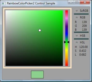
RainbowColorPicker2 Control

The RainbowColorPicker2 control is the composition of the RainbowSlider and the ColorSaturationBox controls. The RainbowColorPicker2 is full fledged color picker allowing you to select the color Hue with its RainbowSlider and the color Saturation and Luminosity with the ColorSaturationBox part.

That is the sample:

At the figure above the Bisque border is given to the RainbowColorPicker2 control just to make it distinctive.

The RainbowColorPicker2 has the SelectedColor Dependency Property used to get or set the value of the Color selected. When the SelectedColor changes the RainbowColorPicker2 raises the SelectedColorChanged event.

The code

You can download the code and the samples here:

http://cid-39d56f0c7a08d703.skydrive.live.com/embedrowdetail.aspx/.Public/WPFGears/WPFGears.zip

The archive contains my WPFGears library with samples, tests, etc. It’s the Visual Studio 2008 SP1 solution targeted to .NET Framework 3.5.

You’ll find RainbowColorPicker2Sample project there. RainbowColorPicker2 control code is in the WPFGears library project ColorPickerControls folder.

Regards,
Oleg V. Polikarpotchkin

Technorati Теги: ,,
Posted in Uncategorized | Leave a comment

RainbowColorPicker Control

This element is the one more control from the ColorPicker constituent controls bug in addition to the published in my recent posts.

The RainbowColorPicker control is the composition of the RainbowBox and the LuminositySlider controls. The RainbowColorPicker is full fledged color picker allowing you to select the color Hue and Saturation with its RainbowBox and the color Luminosity with the LuminositySlider part.

That is the sample:

At the figure above the Bisque border is given to the RainbowColorPicker control just to make it distinctive.

The RainbowColorPicker has the SelectedColor Dependency Property used to get or set the value of the Color selected. When the SelectedColor changes the RainbowColorPicker raises the SelectedColorChanged event.

The code

You can download the code and the samples here:

http://cid-39d56f0c7a08d703.skydrive.live.com/embedrowdetail.aspx/.Public/WPFGears/WPFGears.zip

The archive contains my WPFGears library with samples, tests, etc. It’s the Visual Studio 2008 SP1 solution targeted to .NET Framework 3.5.

You’ll find RainbowColorPickerSample project there. RainbowColorPicker control code is in the WPFGears library project ColorPickerControls folder.

Regards,
Oleg V. Polikarpotchkin

Technorati Теги: ,,
Posted in Uncategorized | Leave a comment

LuminositySlider Control

This element is one more control from the ColorPicker constituent controls bug in addition to the published in my recent posts.

LuminositySlider control is designed as the selector of the Color with the HSL Color model Luminosity ranging from 0 to 1. It’s the extension of the Slider control.

LuminositySlider is provided with the reference Color through the BaseColor Dependency Property. It displays that reference Color gradient starting from the reference Color with the Luminosity set to 0 up to the Color with the Luminosity of 1.

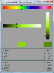
That is the sample:

At the top is the RainbowSlider allowing to select the BaseColor for two LuminositySliders (horizontal and vertical) below it.

LuminositySlider has read-only SelectedColor Dependency Property used to get the value of the Color selected. This property value is synchronized with Minimum, Maximum and Value properties values of the parent Slider control. The caller can set the desired luminance value from the code as follows:

Value = Luminance * (Maximum - Minimum) + Minimum;

When the SelectedColor changes the LuminositySlider raises the SelectedColorChanged event.

The direction the Luminosity value changes depends on the value of IsDirectionReversed property. If it’s false (the default) the minimum Luminosity is at the left or at the bottom of the control depending on the orientation.

The code

You can download the code and the samples here:

http://cid-39d56f0c7a08d703.skydrive.live.com/embedrowdetail.aspx/.Public/WPFGears/WPFGears.zip

The archive contains my WPFGears library with samples, tests, etc. It’s the Visual Studio 2008 SP1 solution targeted to .NET Framework 3.5.

You’ll find LuminositySliderSample project there. LuminositySlider element code is in the WPFGears library project ColorPickerControls folder.

Regards,
Oleg V. Polikarpotchkin

Technorati Теги: ,,,
Posted in Uncategorized | Leave a comment

RainbowBox Element

This element is the one more control from the ColorPicker constituent controls bug in addition to the published in my recent posts.

RainbowBox element is designed as the tool to select a Color from the color spectrum and is close to the one in the Windows Common Color dialog. It extends the FrameworkElement.

The horizontal color spectrum is overlaid by the vertical gradient ranging from transparent color to Gray color. That is the sample.

You select the color with the color selector (small white circle with black border). You can drag it with the mouse or just click anywhere on the RainbowBox element surface. You can provide you own color selector drawing with the RainbowBox.Selector Dependency Property.

Read-only SelectedColor Dependency Property of the RainbowBox used to get the value of the Color selected. User can change the SelectedColor property from its code using the SelectorPosition property. The SelectorPosition property gets or sets the selector position normalized to [0,1 0,1] rectangle. Another way to change the SelectedColor property from the code is the RainbowBox.TrySetSelectedColor method. It gets the color argument and tries to find that color in the Rainbow. On success it sets the selector position accordingly and returns true; otherwise it returns false. When the SelectedColor changes the RainbowBox raises the SelectedColorChanged event.

The Rainbow Dependency Property allows to get or set the color spectrum. It’s of the GradientStopCollection type i.e. represents the sequence of colors along with the position of the color in the spectrum. By default the spectrum is the sequence of equally spaced Red, Orange, Yellow, Green, Blue, Indigo, Violet, Red colors. When the Rainbow property changes the RainbowBox tries to find the current SelectedColor value in the new Rainbow. On success it sets the selector position accordingly; otherwise it sets the selector position to the top-left corner and changes its SelectedColor to the value corresponding to that position.

The code

You can download the code and the samples here:

http://cid-39d56f0c7a08d703.skydrive.live.com/embedrowdetail.aspx/.Public/WPFGears/WPFGears.zip

The archive contains my WPFGears library with samples, tests, etc. It’s the Visual Studio 2008 SP1 solution targeted to .NET Framework 3.5.

You’ll find RainbowBoxSample project there. RainbowBox element code is in the WPFGears library project ColorPickerControls folder.

Regards,
Oleg V. Polikarpotchkin

Technorati Теги: ,,,
Posted in Uncategorized | Leave a comment

ColorSaturationBox Element

This element is one more control from the ColorPicker constituent controls bug in addition to ones published in my recent posts.

ColorSaturationBox element is designed as the tool to select a Color from the mix of some Color with the White and Black colors. It extends the FrameworkElement. The idea of this element is borrowed from the Uncommon Dialogs: Font Chooser & Color Picker Dialogs article.

The color surface to select color from is the superposition of some color gradients. Roughly it consists of

  1. Vertical BaseColor-Black gradient.
  2. Vertical White-Black gradient with Horizontal Opacity mask gradient.

BaseColor is the variable reference color you can get or set with the BaseColor Dependency Property.

That is the sample.

The ColorSaturationBox element is at the top-left window corner. At right of it is the RainbowSlider (see here) used to select the value of BaseColor. The SelectedColor sample is at the right-top corner. Below it the SelectedColor components are displayed in numbers.

You select the color with the color selector (small white circle with black border). You can drag it with the mouse or just click anywhere on the ColorSaturationBox element surface. A propos, you can provide you own color selector drawing with the ColorSaturationBox.Selector Dependency Property.

Read-only ColorSaturationBox.SelectedColor Dependency Property used to get the value of the Color selected. User can change the SelectedColor property from its code using the SelectorPosition property. The SelectorPosition property gets or sets the selector position normalized to [0,1 0,1] rectangle. When the SelectedColor changes the ColorSaturationBox raises the SelectedColorChanged event.

The code

You can download the code and the samples here:

http://cid-39d56f0c7a08d703.skydrive.live.com/embedrowdetail.aspx/.Public/WPFGears/WPFGears.zip

The archive contains my WPFGears library with samples, tests, etc. It’s the Visual Studio 2008 SP1 solution targeted to .NET Framework 3.5.

You’ll find ColorSaturationSample project there. ColorSaturationBox element code is in the WPFGears library project ColorPickerControls folder.

Regards,
Oleg V. Polikarpotchkin

Technorati Теги: ,,
Posted in Uncategorized | Leave a comment